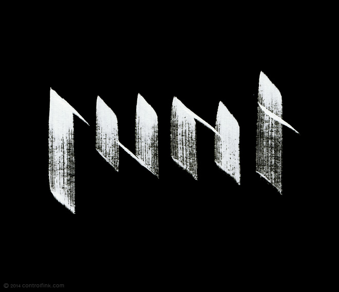
I don’t know why it always suprises me when the best results arrive after you throw out your plans.
Just like the logo (and the character himself,) the name of my fantasy comic has changed over time. From the wordy “The Chronicles of Raven” to the uncopyrightable “Raven,” from the short-lived and insipid “Incendiary” (it has the word diary in it, clever) to the final pithy and punchy “Runt.”
Once the name stuck the logo had a bit of a split personality: one version runic and ye olde worldey; and the other old school metal band. A recent makeover of the latter into a more standard blackletter style ended up a bit sterile. Inspired by the amazing graffiti brushwork of Niels “Shoe” Meulman, I bought some ink to dirty it up.
It’s way harder than it looks.
The early wonky stuff was cool, but when I tried to neaten up, it was back in sterile town. Then at the bottom of a dud page, trying to figure out how many strokes the ink would last, it was like a fantasy novel cliche. The two became one!


